Wait for It: Why the Loading Spinner Became a Status Symbol

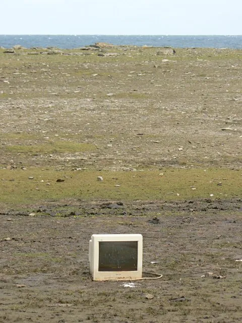
Photo: Dietmar Rabich, CC BY-SA 4.0, via Wikimedia Commons
The spinner as a design statement
For the last twenty years, the loading spinner has been a failure state. It meant the site was slow, the network was weak, or the developer had not optimized the image. Designers treated it like a fire alarm: useful, ugly, something to hide. In 2026, a small but growing number of US studios and startups are doing the opposite. They are putting the spinner on purpose. They are adding a beat of latency before the homepage resolves. They are making you wait, and then asking you to notice that you waited.
The trend has a few names: slow interface, intentional buffering, latency as luxury. None of them are perfect. The basic move is simple. You land on a site. Instead of a fully rendered page, you get a single line of text, a pulsing dot, or a progress bar that moves in human time. One second. Maybe two. Then the page arrives. The delay is not a bug. It is the design.
Why make the internet slower?
The stated reason is philosophical. The attention economy has spent two decades compressing every interaction into a reflex. Infinite scroll, autoplay, push notifications, one-click checkout. Slow design wants to interrupt the reflex. A forced pause is a tiny act of resistance, a speed bump on the road to your own dopamine loop. It says: this is a place, not a slot machine. You are allowed to arrive.
There is also a branding angle. Speed feels cheap now. Every template is fast. Every site can load in 800 milliseconds. If you want to signal care, craft, or scarcity, you make the experience feel handmade. A one-second delay can read like a pour-over coffee or a linen shirt. It is the web equivalent of a heavy door. You notice the weight, and you assume somebody meant it.
Premium, meditative, or just annoying?
Here is where it gets tricky. Waiting is only premium if the thing on the other side is worth it. A fashion label can get away with a slow reveal because you already want the clothes. A local coffee subscription that makes you watch a bean rotate for two seconds is charming once. The third time, you are just trying to order coffee. Slow design has a short half-life. What feels intentional on visit one feels broken on visit ten.
There is also a class problem. Latency is not a neutral aesthetic. For users on fast fiber and new phones, a deliberate pause is a choice. For users on spotty mobile connections or older devices, it is just Tuesday. A design trend that romanticizes waiting can accidentally punch down. The best slow interfaces are honest about this. They use lightweight assets, clear feedback, and an escape hatch. They do not make you wait for the sake of waiting. They make you wait for the sake of attention.
The buffer spinner as motif
Visually, the spinner has become a mascot. Designers are drawing custom ones: a line that draws itself, a dot that breathes, a circle that never quite closes. The old gray pinwheel is gone. The new spinners are soft, organic, almost meditative. They look like something you would see in a wellness app, which is probably the point. The buffer is no longer a signal of failure. It is a signal of intention. It says: hold on, we are doing something.
Small US startups are leaning into this hard. A reading app in Portland uses a one-second breathing animation before each chapter loads. A design studio in Austin has a homepage that takes exactly 1.5 seconds to resolve into a single sentence. A skincare brand in Los Angeles uses a progress bar that fills at the speed of a calm inhale. None of these are technical necessities. They are mood engineering. The wait is the product.
When waiting works
The slow interface works when it is paired with restraint. A minimal site that asks you to wait and then delivers a clean, quiet page feels coherent. A cluttered site that asks you to wait feels like a prank. The rule is simple: if you are going to slow me down, do not waste my time on the other side. The delay is a promise. Keep it.
The trend also works best when it is optional. A toggle, a reduced-motion setting, a fast path for returning users. The point is not to make the internet unusable. The point is to make it feel less automatic. A pause can be a form of respect. It can also be a form of theater. The difference is whether the design remembers that you have somewhere else to be.
In 2026, the buffer spinner is no longer a bug. It is a mood, a brand, and a small philosophical bet. The bet is that people will tolerate a little waiting if the waiting feels like it means something. Sometimes they will. Sometimes they will close the tab. That is the risk of slow design. It asks for attention instead of demanding it. And in a web that has spent years demanding, asking can feel almost radical.