One Button, No Exit: The Apps That Refuse to Be Useful
Photo: Onlysilence, CC BY-SA 4.0, via Wikimedia Commons
The best app I opened this year does exactly one thing. You press a button, and the screen fills with a single shade of blue. There's no way to save it, share it, or change the shade. There's no settings menu. There's no account. There is, as far as I can tell, no exit button — you use the phone's own gesture to leave, like everyone else.
It is, by any conventional product metric, a bad app. It's also the only piece of software I've opened voluntarily more than once a week since spring. Make of that what you will.
The Cost of a Settings Menu
We spent fifteen years making software more configurable, and the bill has come due. Every app now ships with a preferences page, a notification center, a profile, a dashboard, a stats tab, and a set of toggles that shift the burden of the designer's decisions onto the person holding the phone. You are not using the product. You are administering it.
The anti-interface crowd takes the opposite approach. Strip the menus. Kill the settings. Remove the second screen, the exit ramp, the goal state. What's left is a single deliberate action — or sometimes none at all. A site that shows you one color based on the weather in a city you've never visited. A timer that counts down to nothing and then stops. An app that displays a slowly rotating shape and offers no further comment.
The old name for this was net art. The newer, blunter name is useless design, and it's showing up in studios from Brooklyn to Portland, on demo tables at South by Southwest, and in a growing pile of App Store listings that carry a faintly apologetic description paragraph.
What a Single Button Actually Does
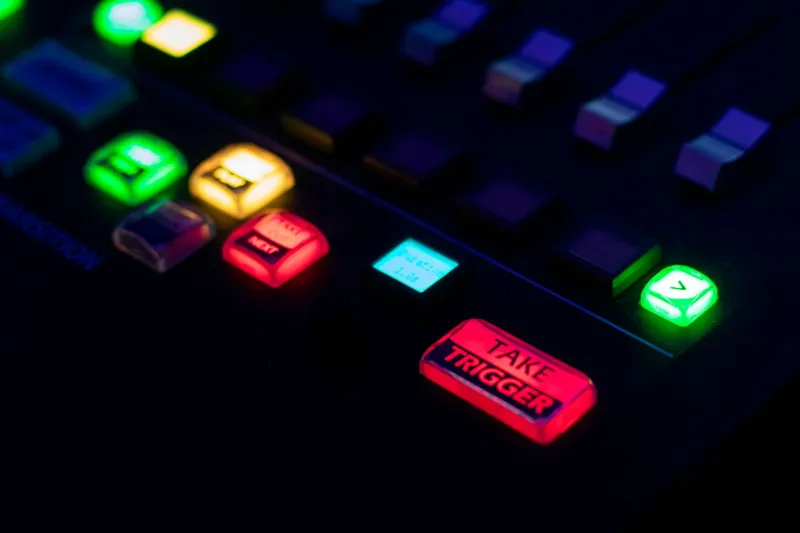
Good constraint work is authorship. When a designer removes your options, they're not being lazy — they're making the call once so you don't have to make it four hundred times. Think about the difference between a camera with one shutter button and a camera app with eleven modes you'll never touch. The single button isn't a limitation. It's a decision someone made on your behalf and then stood behind.
That's the intellectual defense, and it's mostly true. But the emotional draw is simpler than that. A one-button app doesn't want anything from you. It isn't tracking your streak, it isn't nudging you back after three days of silence, it isn't A/B testing a new shade of green on your notifications. There's no funnel. There's nowhere to go.
For a certain kind of exhausted person — which is to say, most people who work on a screen — that absence reads as hospitality.
The Exit Problem
There's a real debate under the aesthetic, though. No exit is a philosophy until it's an accessibility failure. Removing the back button, hiding navigation, refusing to use platform conventions — these choices feel radical in a case study and hostile in a browser. Designers in this space have started arguing publicly about where the line sits, and the argument is worth following, because it's the same one that follows every minimalist wave: who's being served by the restraint, and who's just being locked out.
The better work in this vein understands the difference. It removes the menu but keeps the escape hatch. It refuses the goal but respects the platform. The worse work mistakes hostility for vision and then wonders why nobody opens it twice.
The Protest That Becomes a Product
Here's the part that should worry anyone who likes this stuff. Anti-interface is one good pitch deck away from becoming a premium tier. We've watched minimalism get absorbed before: the clean type, the generous whitespace, the luxury of nothing, all of it repackaged as a status signal for people who can afford to opt out of clutter. There's no reason to think a one-button app is immune.
Already there are apps charging for the privilege of having fewer features, which is a beautiful bit of circular logic and also completely on brand for 2026. The question is whether useless design stays a stance or turns into a screenshot in someone's brand guidelines.
Designing for Nothing
The strongest argument for the anti-interface isn't aesthetic. It's that the attention economy has run out of things to optimize and has started optimizing the exits — the point where you would normally stop, close the tab, and go do something else. A single button is a small room with no productivity in it. A screen that ends is a screen that lets you leave.
That's not a product strategy. It's closer to a protest, and like most protests it's more interesting when it's a little impractical. The app that paints the screen blue doesn't make my life better. It doesn't make me more efficient or more connected or more likely to renew a subscription.
It just stops. Which, honestly, is the feature.