No Home, Just a Signal: The Quiet Death of the Website Front Page
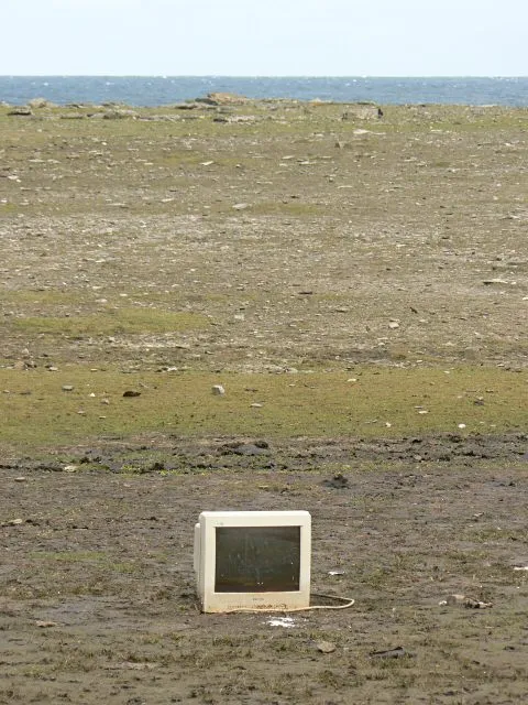
Photo: Hyacinth at English Wikipedia, Public domain, via Wikimedia Commons
The homepage was a lobby. Now it is a door.
I used to love a good homepage. Not a landing page, not a funnel, not a hero section with three CTAs and a stock photo of people high-fiving. A homepage. The weird, dense, slightly embarrassing front door of a website. Links in the sidebar. A hit counter. A mission statement written by someone who clearly had not slept. You could learn a site's whole personality in ten seconds. It was inefficient, and that was the point.
That version of the front page is mostly gone. In its place: a single screen, a blinking cursor, a sentence, maybe an email field. Or nothing at all. Just a logo and a line of text that says something like 'We are building in the dark.' You click, and you are either in or you are out. No navigation. No About Us. No sitemap. The site is not a destination. It is a signal.
The void as a design choice
This is not just minimalism. Minimalism has been corporate for years. This is something stranger. A lot of new sites look like they were built for a frequency, not a browser. They hum. They pulse. They ask you to tune in. The domain name might be a string of consonants. The homepage might be a black screen with a waveform. The only copy is a date and a location. It is less like a website and more like a pirate radio station that happens to have a URL.
For tech-savvy users, this is a feature. The traditional homepage is a sales pitch. The single-screen signal is a filter. It says: if you do not get it, you are not the audience. That sounds exclusionary, and sometimes it is. But it is also a reaction to a web that has become almost entirely legible to algorithms and almost entirely illegible to humans. When every page is optimized for search, every headline is optimized for clicks, and every brand is optimized for sameness, a blank screen can feel like a relief. It is a refusal to explain yourself before you have been understood.
Discovery is changing, not dying
The obvious objection is discovery. If there is no homepage, how do people find you? The answer is that they were not finding you through the homepage anyway. They were finding you through a link in someone's newsletter, a screenshot on X, a Discord message, a friend's group chat. The homepage was never the main entrance. It was the lobby you walked through after you already decided to come in. In 2026, the link is the front door. The homepage is just the room behind it.
That shift changes brand identity. A traditional site says: here is everything we do. A signal site says: here is the feeling we produce. The feeling might be a color, a typeface, a delay, a sound. It is more ambient than informational. For a certain kind of studio, label, or artist, that is enough. The people who need the details will find the details. The people who do not will bounce, and that is fine. The void is a filter, not a funnel.
The cost of being a signal
There are real costs. A site that refuses to explain itself is harder to trust. It can read as pretentious, evasive, or empty. It can also be a cover for having nothing to say. The single-screen trend has produced some genuinely beautiful experiences and some genuinely lazy ones. A black page with a serif font is not automatically profound. A blinking cursor is not automatically a brand. The signal has to carry something. Otherwise it is just static.
There is also an accessibility problem. Abstract landing pages often forget that not everyone arrives with the same context, the same bandwidth, or the same ability to parse a vibe. A site that communicates only through mood can exclude people who need plain language, clear navigation, or a visible contact link. The void is a design choice, but it is not a neutral one. The best signal sites know this. They hide the details, but they do not remove them. They give you a door, and they make sure the door opens.
The front page is dead. Good.
I do not think the homepage is coming back, at least not in the form I loved. The web is too fragmented, too feed-driven, too personally routed. We arrive through screenshots and group chats and algorithmic side doors. The site that waits for us at the end of the link does not need to be a lobby. It can be a room. It can be a signal. It can be a single screen that says: you are here, and so are we.
That is a loss for people who liked the old density. It is a gain for people who want the web to feel like a place again, even if that place is mostly empty. The front page is dead. Long live the void. The only question is whether the void has anything to say. The good ones do. They just make you lean in to hear it.