Deliberately Broken: Why Musicians and Designers Are Choosing Ugly on Purpose
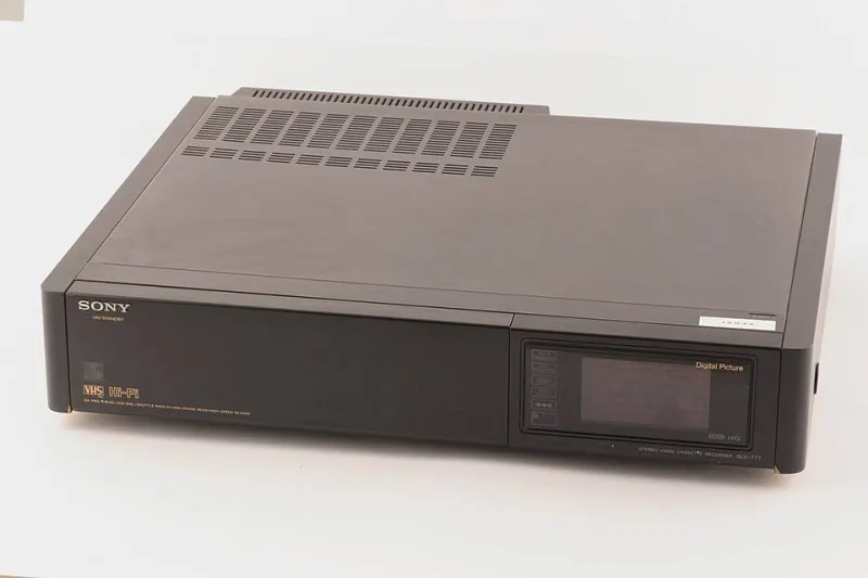
Photo: Sony (progettista/ costruttore), CC BY-SA 4.0, via Wikimedia Commons
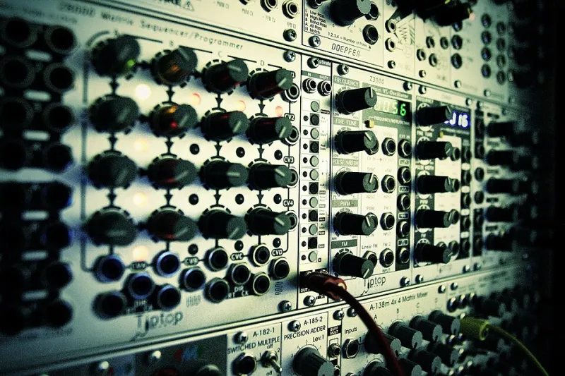
Somewhere in a rented studio in East Nashville, a producer named Deja is running a brand-new recording through a circuit-bent cassette deck from 1983, then feeding the output into a sampler set to the lowest possible bit depth, then printing that to tape before digitizing it again. The result is grainy, warm, and buzzing with artifacts that no plugin can convincingly fake. It sounds, she says, "like something that actually happened."
This is not a workflow born from budget constraints. Deja has access to high-end gear. She's choosing the degradation.
The Fatigue Is Real
High definition was supposed to be the destination. Lossless streaming. OLED displays. Dolby Atmos. The relentless march toward perfect fidelity has been one of the defining technological promises of the last two decades — the idea that if we could just capture and reproduce reality with enough precision, the experience would be complete.
But perfection turned out to have a texture problem. The cleaner the signal, the more clinical it feels. The higher the resolution, the more distance it creates between the image and any sense of warmth or presence. Somewhere around the time every streaming platform started offering spatial audio, a lot of listeners and viewers quietly started preferring things that sounded and looked a little rougher.
"There's a sterility to ultra-high-def everything," says Jordan, a visual designer based in Chicago who works primarily in pixel art and compressed GIF formats. "It's technically impressive and completely cold. When I look at something that's been through some damage — some compression, some noise — I feel like I'm looking at a thing that exists in time. Perfect resolution feels like a photograph of a photograph."
What Bitcrushing Actually Does
Bitcrushing, for the uninitiated, is a process of intentionally reducing the bit depth and sample rate of audio — essentially throwing away information to create distortion, grit, and that distinctive crunchy quality associated with old video game soundtracks and early digital recording. It's the sonic equivalent of running a photo through a photocopier a few dozen times.
The technique has been around for decades. What's new is the context in which people are reaching for it. Once a niche production trick, bitcrushing and its visual equivalents — dithering, pixel scaling, VHS simulation, JPEG artifacting — have migrated from the margins into a genuine aesthetic movement with a coherent set of values behind it.
Those values have less to do with nostalgia than people assume. Yes, there's a generational component — millennials reaching back toward the textures of their childhood, Gen Z fetishizing analog eras they never lived through. But the more interesting motivation is philosophical, not sentimental.
The Argument Against Hyperreality
The term hyperreality gets thrown around in art theory circles, but its practical meaning is pretty straightforward: a simulation of reality that's more intense, more saturated, and more optimized than anything that actually occurs in nature. Social media feeds are hyperreal. AI-generated imagery is hyperreal. The color-graded, AI-upscaled, algorithmically perfected content ecosystem we all swim in daily is hyperreal.
Lo-fi aesthetics push back against that by introducing evidence of process. Tape hiss says: this was recorded somewhere, at some moment, by something physical. Pixel art says: a human made a decision about every single dot. Compression artifacts say: this passed through a machine and the machine left its fingerprints.
"When everything is perfect, nothing feels real," says Marcus Webb, a Los Angeles-based composer who scores short films using entirely hardware-based synthesis and deliberately avoids any digital cleanup in post. "The imperfection is the proof of existence. It's the signature of a thing that actually happened in the world."
Webb's scores are purposefully lo-fi in a way that requires significant effort to achieve authentically — he rejects the irony of using a VST plugin to simulate degradation when the real thing is available and arguably sounds better. "The fake version always sounds like someone's idea of lo-fi," he says. "The real version just sounds like lo-fi."
Wellness in the Noise
There's a quieter thread running through this movement that doesn't get discussed as often: people find lo-fi genuinely relaxing in a way that high-definition media often isn't.
The lo-fi hip-hop study stream phenomenon — those endlessly looping YouTube channels with the animated girl at the desk — became a genuine cultural touchstone precisely because it worked. The muffled beats, the vinyl crackle, the slightly blurry visuals created a sensory environment that felt gentle and undemanding in a way that crisp, optimized media rarely does.
Researchers studying auditory environments and focus have noted that a moderate level of ambient noise and sonic imperfection can reduce cognitive overload compared to either silence or high-stimulation audio. Whether that's the mechanism or just a correlation, the anecdotal evidence is overwhelming: a lot of people work better, sleep better, and decompress more effectively with degraded audio in the background than with pristine, mastered recordings.
"It's not asking anything from you," says Deja. "Perfect sound is demanding. It wants your attention. Lo-fi just sits there."
Designing for Imperfection
The visual side of this movement is equally deliberate. A growing cohort of digital designers — particularly those building for experimental or independent web projects — are actively choosing lower resolution assets, monochrome palettes, and interface elements that look like they were assembled in 1998. Not because they can't do better, but because the roughness communicates something the polished version can't.
Jordan's recent project, a small web-based interactive piece, uses 16-color graphics and MIDI-style sound effects throughout. The whole thing loads in under 200 kilobytes. "It's a choice to exist lightly," she says. "Big, heavy, high-def things feel like they're trying to colonize your attention. Small, compressed things feel like they respect your time."
That framing — respecting the audience's attention rather than maximizing its capture — sits at the heart of what separates intentional lo-fi from simple cost-cutting. The degradation is a design decision with a point of view embedded in it.
The Signal in the Static
None of this means high definition is going anywhere. The mainstream will keep chasing clarity, losslessness, and resolution for as long as those things can be sold as upgrades. But the counter-current is real, and it's getting louder — or rather, grainier.
What the lo-fi movement is really doing is questioning the assumption that more information always means more meaning. Sometimes the cassette hiss tells you something the clean digital transfer can't. Sometimes the pixel grid is more expressive than the photograph. Sometimes the broken thing is the honest thing.
The void has a texture. Turns out people kind of love it.