Logo Dropout: The Corporate Flex of Having Nothing to Prove
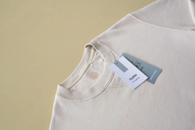
There's a hoodie circulating in certain corners of the internet right now. No logo. No brand name. No little embroidered horse or swoosh or interlocking letters. Just a perfect, heavy-weight pullover in a shade of gray that doesn't quite have a name. It costs $340. It sold out in four hours.
This is where we are now.
The Loudest Move Is Saying Nothing
For most of the 20th century, branding was a volume game. Bigger logos. Bolder colors. More surface area covered in your name. The idea was simple: the more people see it, the more they want it. That logic built empires — Nike, Ralph Lauren, Louis Vuitton, Supreme. Visibility was currency.
Something flipped. Quietly, and then all at once.
Major corporations — and the smaller labels they've quietly acquired or cloned — have started stripping visual identity down to almost nothing. The logos get smaller, then move to the inside tag, then disappear entirely. The brand name vanishes from the website header. The packaging becomes a matte rectangle with a single line of text in a font so neutral it barely registers. Some companies are going even further, releasing products under entirely different names, deliberately severing any visible connection to their parent company.
This isn't minimalism as aesthetic. It's minimalism as strategy. And it's working.
Why Gen Z Treats Logos Like Red Flags
The psychology here isn't complicated once you sit with it. Gen Z grew up drowning in advertising. Every surface, every feed, every moment of potential silence was colonized by something trying to sell them something. By the time they had spending power, they'd developed a near-allergic reaction to overt brand signaling.
Wearing a giant logo became a tell. It said: I bought into it. I'm a mark. The flex shifted from showing off what you could afford to demonstrating that you were too discerning to need the label to prove it. Affluent Gen Z consumers — and the millennials who've aged into a similar headspace — started gravitating toward things that felt discovered rather than marketed. Things that didn't announce themselves.
The brands noticed. Of course they noticed.
What followed was a calculated retreat. Companies started funding or acquiring "stealth" lines — products designed to look like they came from some small-batch operation nobody's heard of yet. The storytelling moved away from heritage and prestige and toward craft, material, process. The logo either shrank to a whisper or got cut entirely. The message became: we don't need to tell you who we are. You either know, or you don't.
The Stealth Playbook
The mechanics of this are worth unpacking because they're genuinely strange. A multinational corporation — one with a marketing budget larger than most countries' GDP — deliberately makes itself harder to find. It creates friction. It withholds information. It manufactures the sensation of obscurity.
Some do it through what's being called "ghost branding" — releasing products under completely separate identities that have no obvious paper trail back to the parent company. Others take a subtler route: keeping the name technically present but making it so understated, so stripped of context, that it reads more like a material spec than a brand mark. The logo becomes a whisper in the collar. The website looks like a design student's thesis project. The Instagram account has 4,000 followers and posts maybe twice a month.
The goal is to feel like something you found, not something that found you.
And here's the part that should make everyone at least a little uncomfortable: it works precisely because the product is still excellent. These companies aren't cutting corners on quality to fund the vanishing act. If anything, they're investing more in the actual object — the fabric weight, the construction, the sourcing — because when there's no logo to carry the weight of perceived value, the thing itself has to do the job.
The Paradox at the Center
Here's what makes the whole trend feel a little dizzying when you stare at it long enough: the unbrand is still a brand.
The absence of a logo is itself a logo now. The deliberate blankness signals something very specific to the people it's aimed at. It says: we know you're too smart for this, and we're too smart for this too, so here's a $300 t-shirt with nothing on it. The communication hasn't stopped — it's just been encoded. You need the right cultural literacy to decode it, which is exactly the point.
Exclusivity used to be about price or scarcity. Now it's also about legibility. If you can read the signal, you're in the room. If you can't, the product was never really speaking to you anyway.
There's something genuinely interesting about that from a design-theory standpoint. And something genuinely cynical about it from every other standpoint.
Can You Actually Disappear and Stay Profitable?
The short answer is yes, but it requires a specific kind of consumer — one with enough disposable income to spend $300 on a blank hoodie and enough cultural fluency to understand why that's the move. That's not a huge market. It's a dense one, though, and it's concentrated in exactly the demographics that set trends.
The longer answer is that these stealth-brand experiments tend to have a shelf life. The whole value proposition depends on obscurity, and obscurity is hard to maintain when you're a publicly traded company with quarterly targets. Eventually the thing gets written up. The TikTok finds it. The algorithm surfaces it to people who weren't supposed to know about it yet. And once the signal gets too loud, the original audience starts looking for the next quiet frequency.
Some brands seem to understand this and plan for it — treating each stealth line as a limited-run operation, burning it down before it gets too visible, starting over somewhere else under a different name. It's an exhausting way to run a business. It's also, weirdly, kind of fascinating as a cultural artifact.
The Signal Underneath the Silence
What the unbrand trend actually tells us isn't really about design or even marketing. It's about how status communication evolves when every previous signal gets saturated.
The logo was a shortcut. It let you broadcast wealth and taste without saying a word. When everyone could afford the logo — or a convincing knock-off — the shortcut stopped working. So the signal moved somewhere harder to fake: the quality of the object itself, the obscurity of the source, the in-group knowledge required to recognize it for what it is.
Void Signal, as a concept, feels relevant here. The companies doing this most effectively aren't broadcasting nothing — they're broadcasting on a frequency most people can't tune into. The silence is the message. The blank label is the loudest thing in the room, if you know how to listen.
Whether that's a genuine cultural shift or just the most elaborate marketing sleight-of-hand in recent memory probably depends on who's holding the hoodie.